Turquoise Truck · Hospitality Marketing Consultancy Let’s talk →
Brand & launches · Club Italiano

Brand identity.

Club Italiano is a supper club with Italian style and local flair. We built the identity from zero: the story, the mark, the type, the colour, and how every photo should feel.

Real work · Club Italiano brand guidelines and the 2025 refresh concept
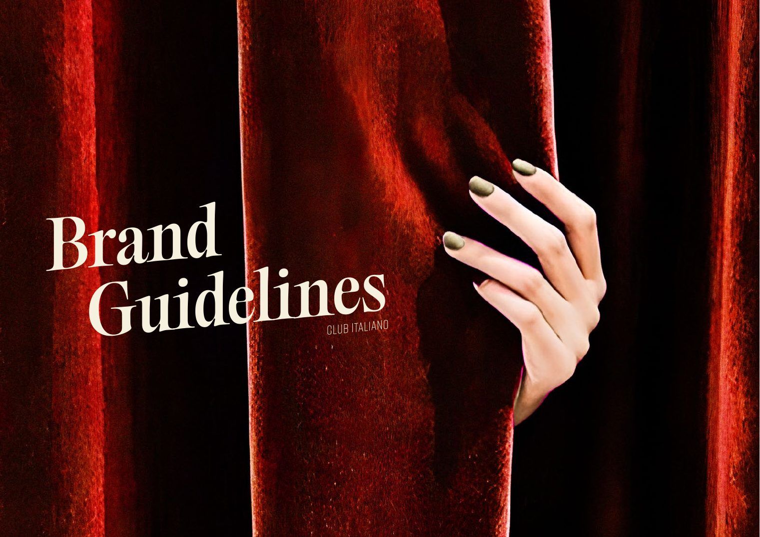
Brand guidelines
Brand guidelines

The story

Before a logo, a sentence the whole team could repeat. Everything after it had to feel like this.

Brand story
Italian style with local flair.

Club Italiano transforms dining into a multi-layered culinary adventure, infusing the easygoing and unscripted atmosphere of a supper club with a hearty, generous and worldly Italian influence.

Brand promiseChe Gioia!

A relaxed ambiance that combines warmth and generosity with a passion for life and contemporary Italian cuisine. Each visit is a homecoming.

Brand pillars
  • Warmth & GenerosityA friendly, informal and inclusive service and ambiance: familiar, welcoming, playful.
  • Playful DecadenceA passion for life that excites delight, zest and eccentricity in every encounter.
  • Italian StyleContemporary Italian cuisine and culinary excellence, in every moment.
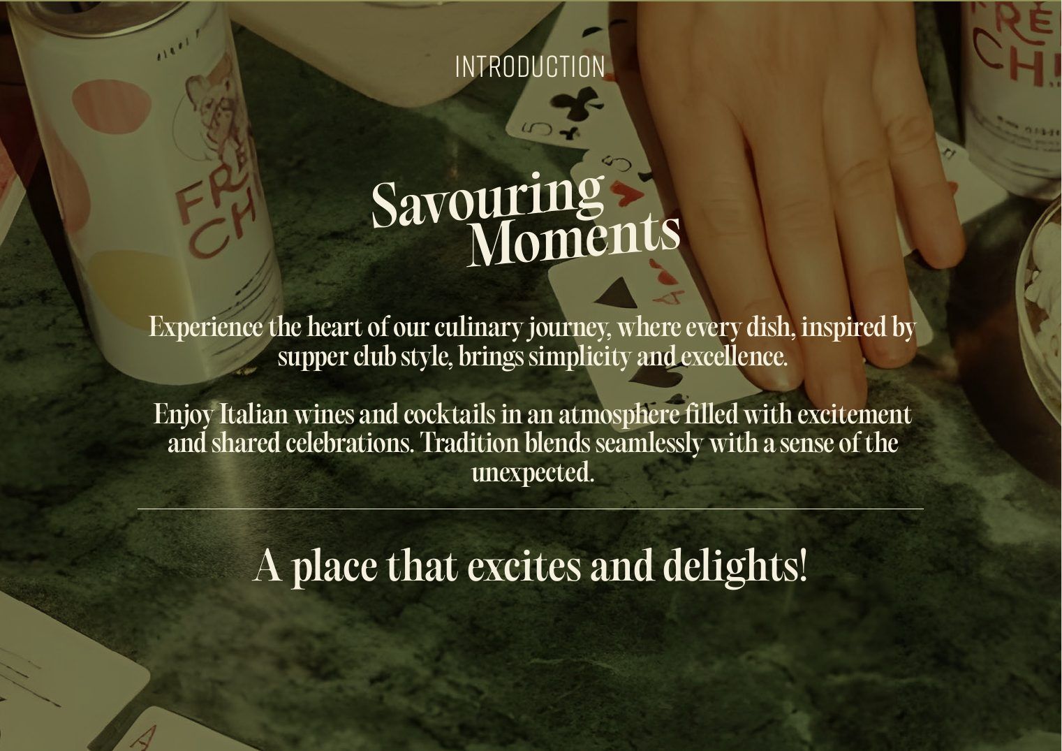
Introduction
Introduction
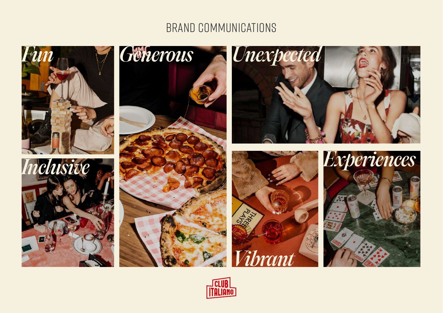
Brand communications

The mark

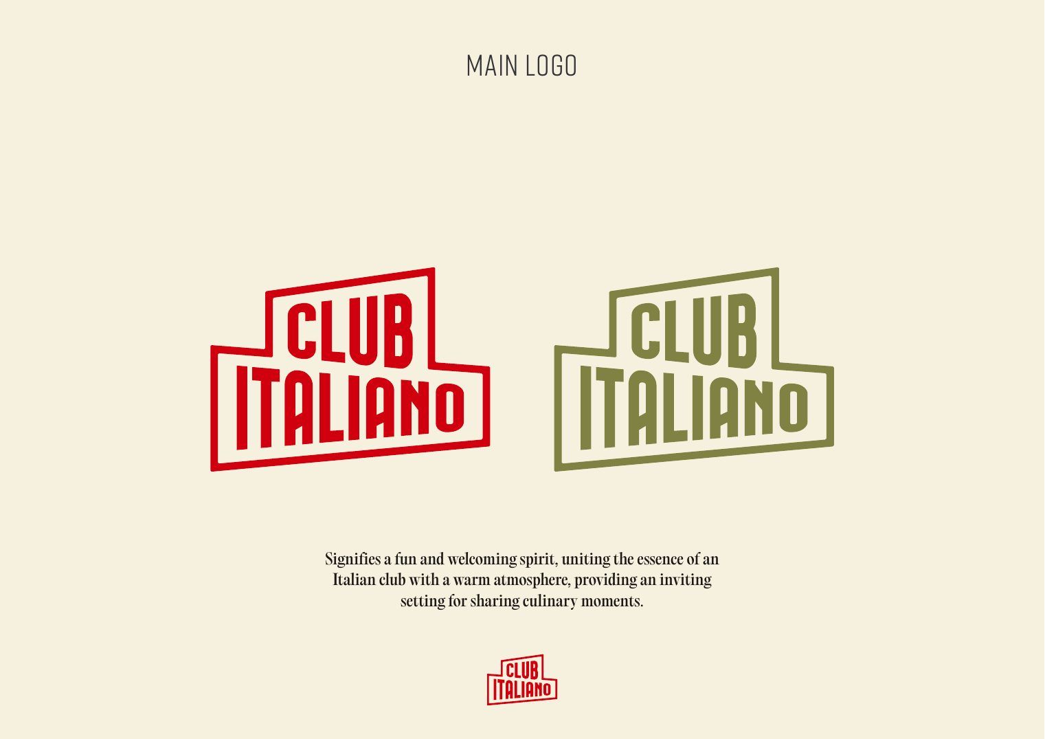
A club sign, not a corporate logo: blocky, warm and a little theatrical, built to work on a door, a matchbox or an Instagram avatar.

Main logo

Signifies a fun and welcoming spirit, uniting the essence of an Italian club with a warm atmosphere.

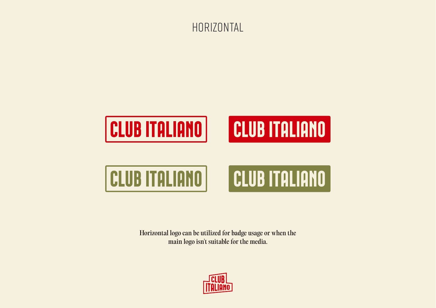
A horizontal version covers badges and narrow formats. Clear-space and misuse rules keep it consistent across every channel.

Main logo
Main logo
Horizontal logo
Horizontal logo
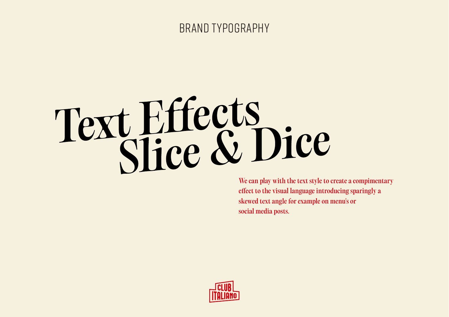
Text effects
Text effects

Type & colour

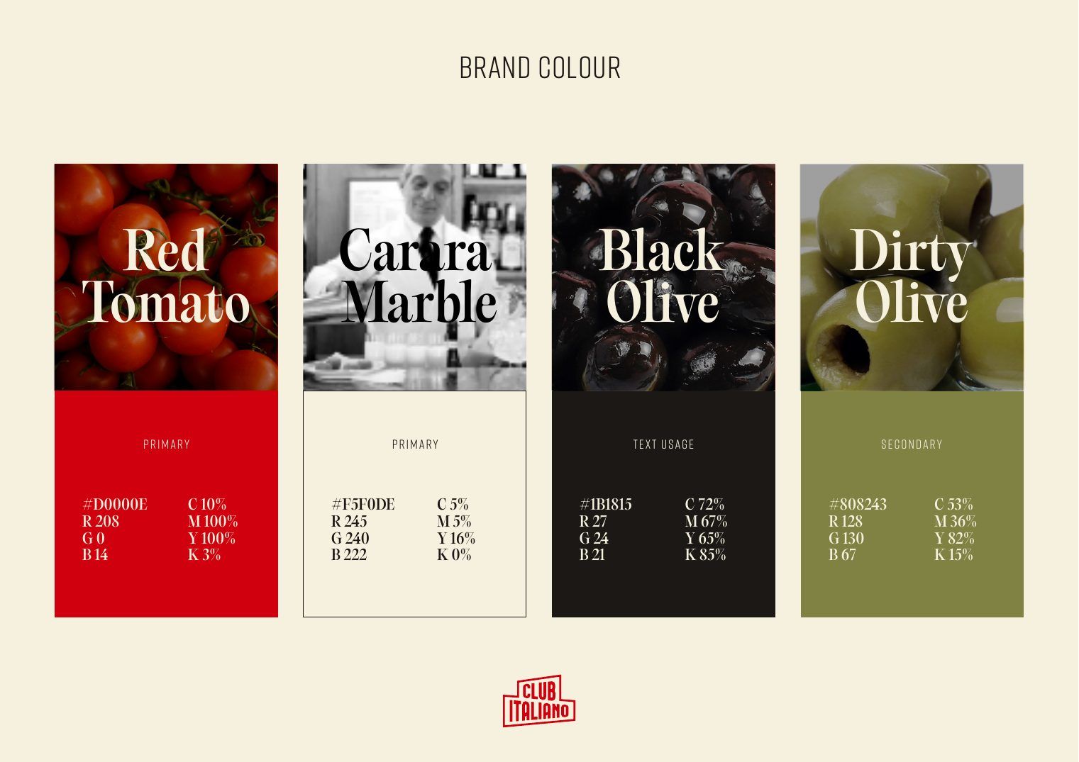
Bagatela for headlines, Rift for sub-heads, and a palette taken straight from the table: tomato, marble and olive.

Brand colour
Brand colour

Photography

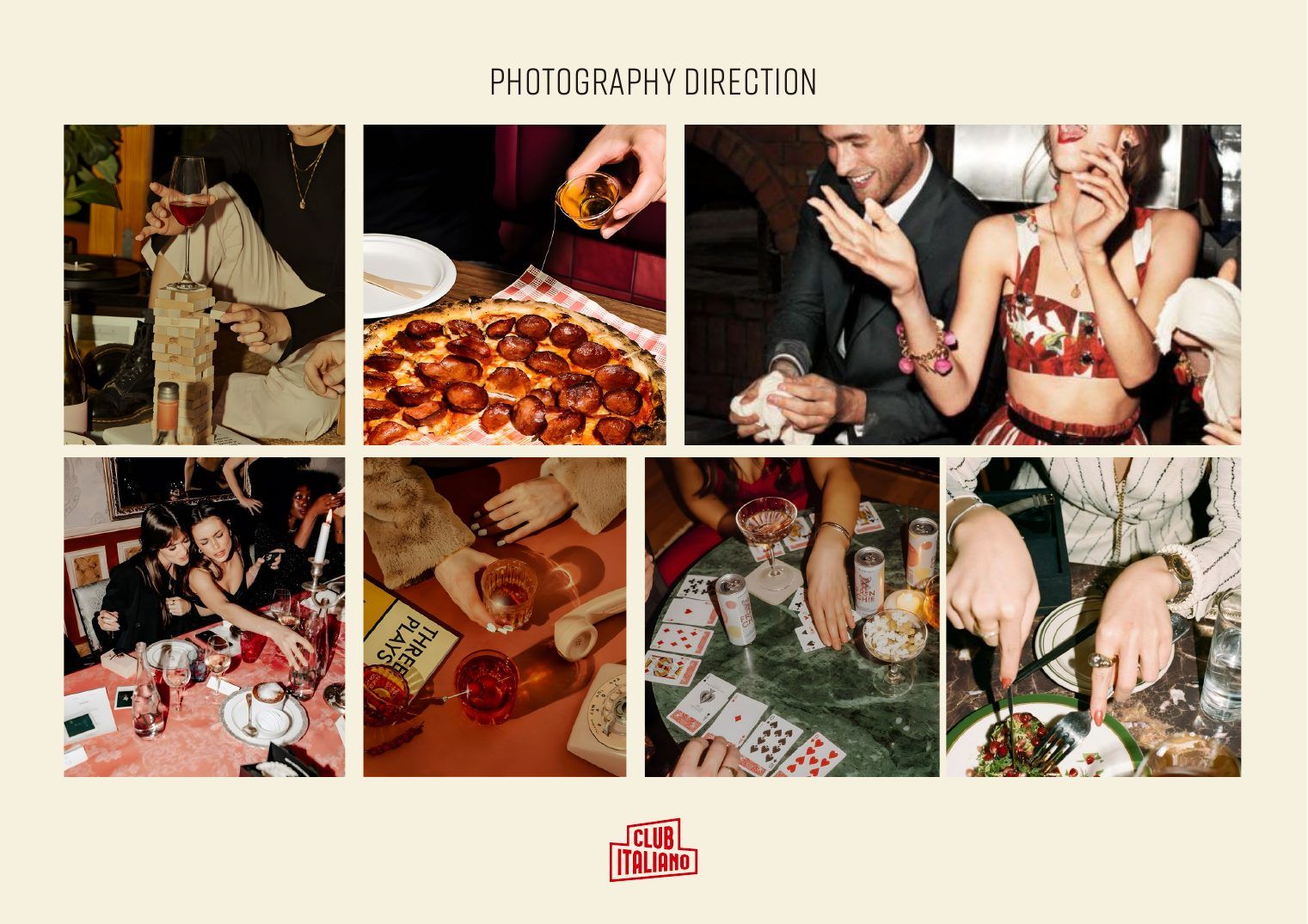
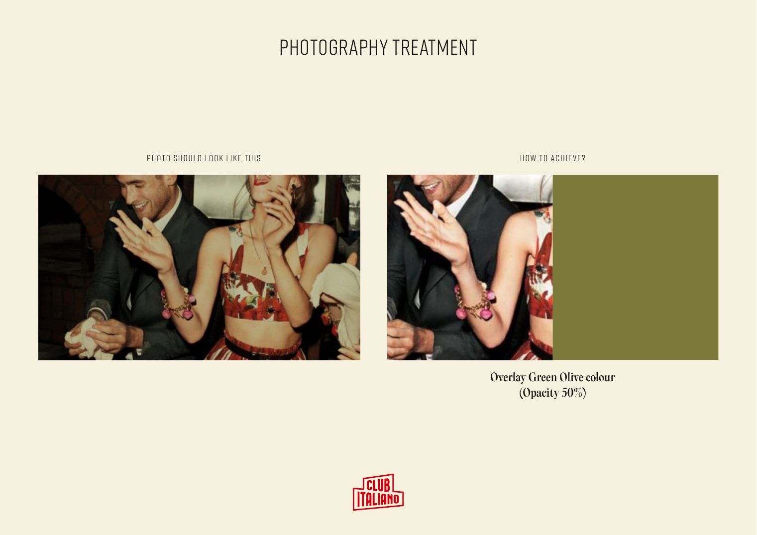
Warm, close and caught mid-moment. A dirty-olive overlay at 50% ties every image back to the palette.

Photography direction
Photography treatment
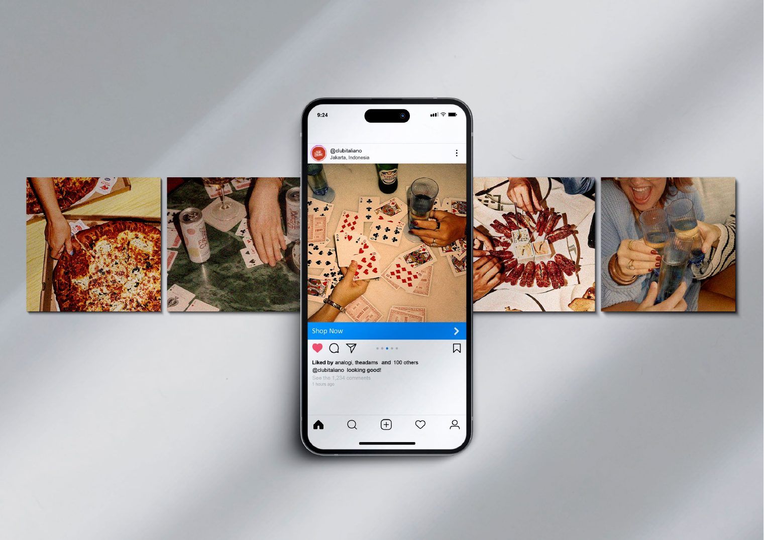
On social
On social

In use

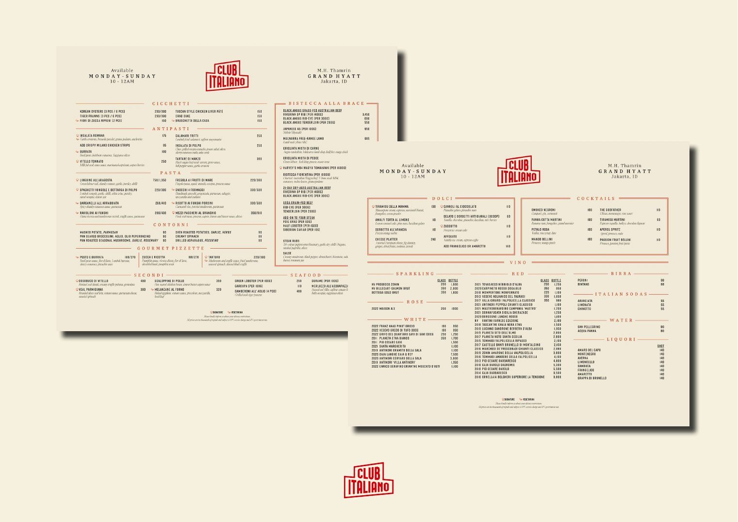
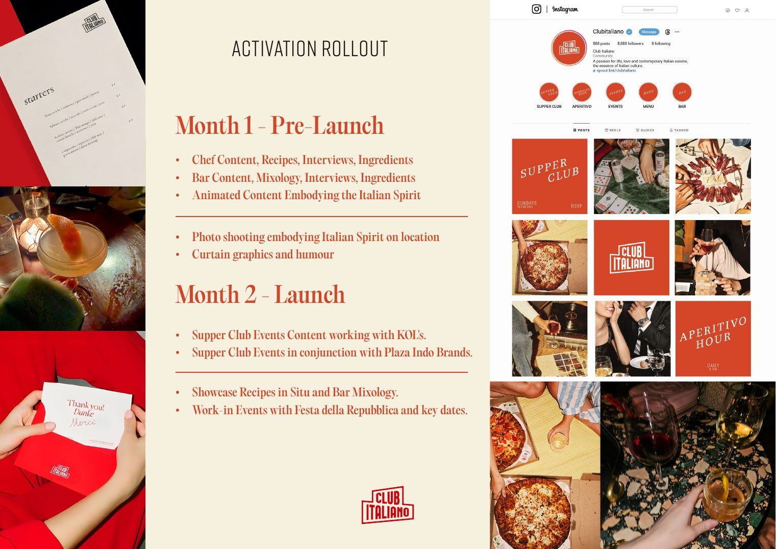
Menus, social and a two-month rollout plan, so the identity arrived everywhere at once.

Menus
Menus
Activation rollout
Activation rollout
Concept · 2025

The 2025 refresh

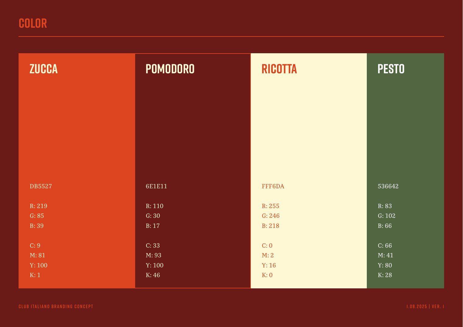
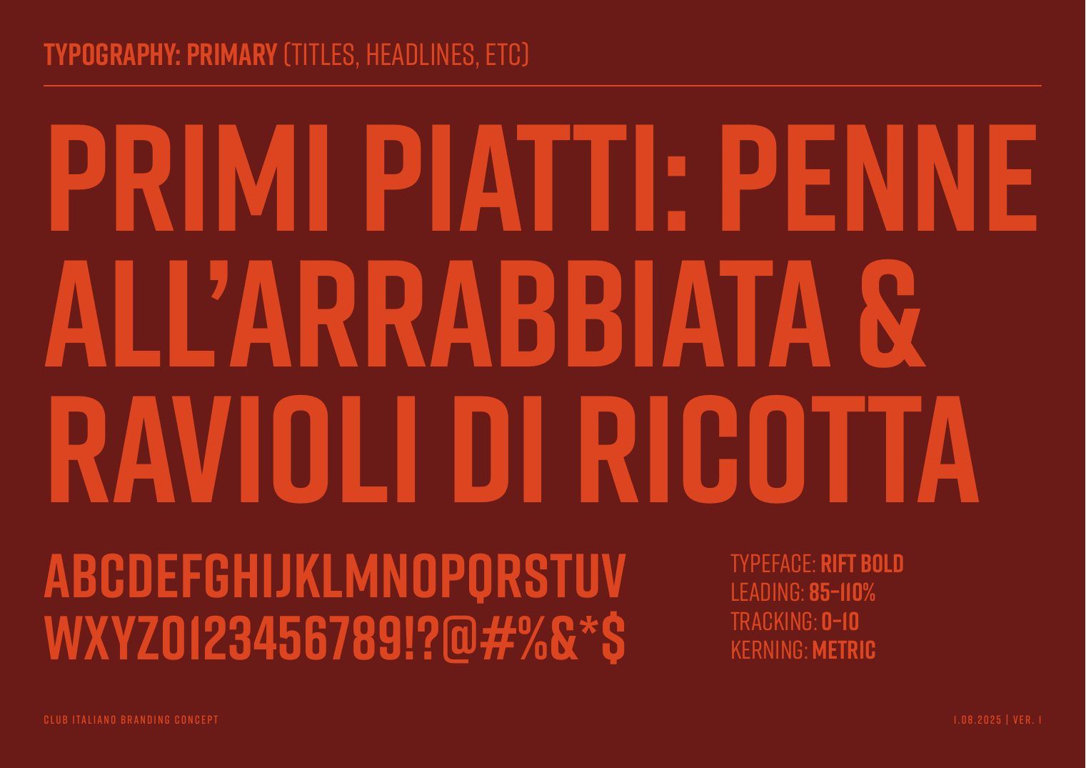
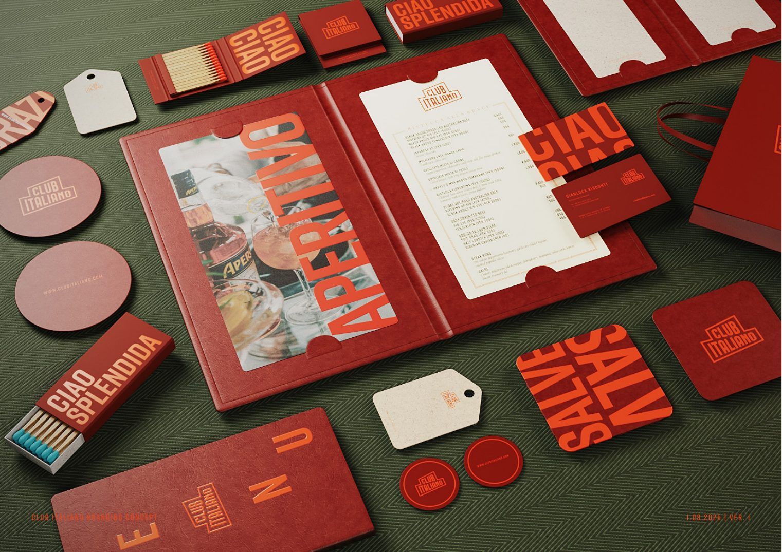
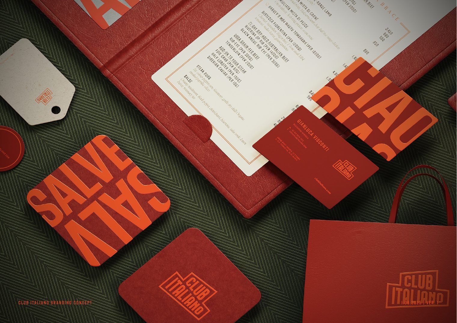
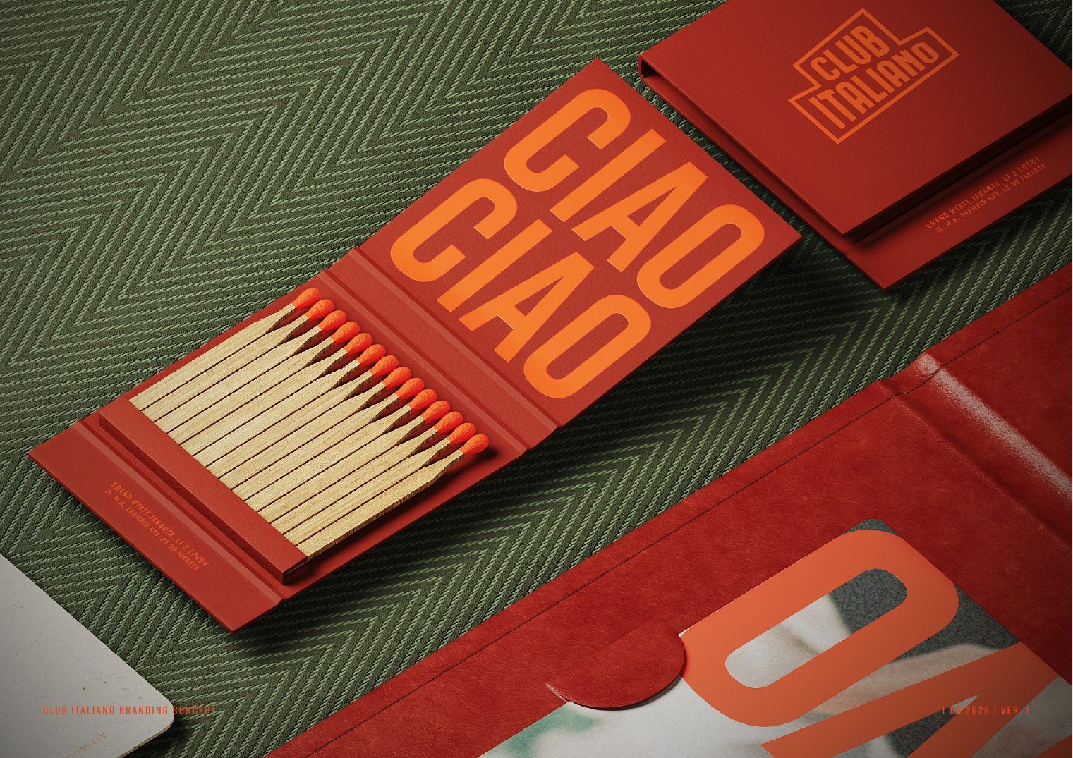
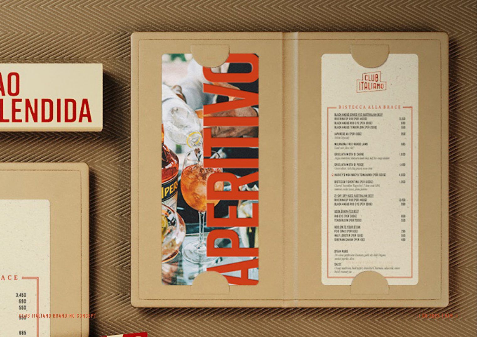
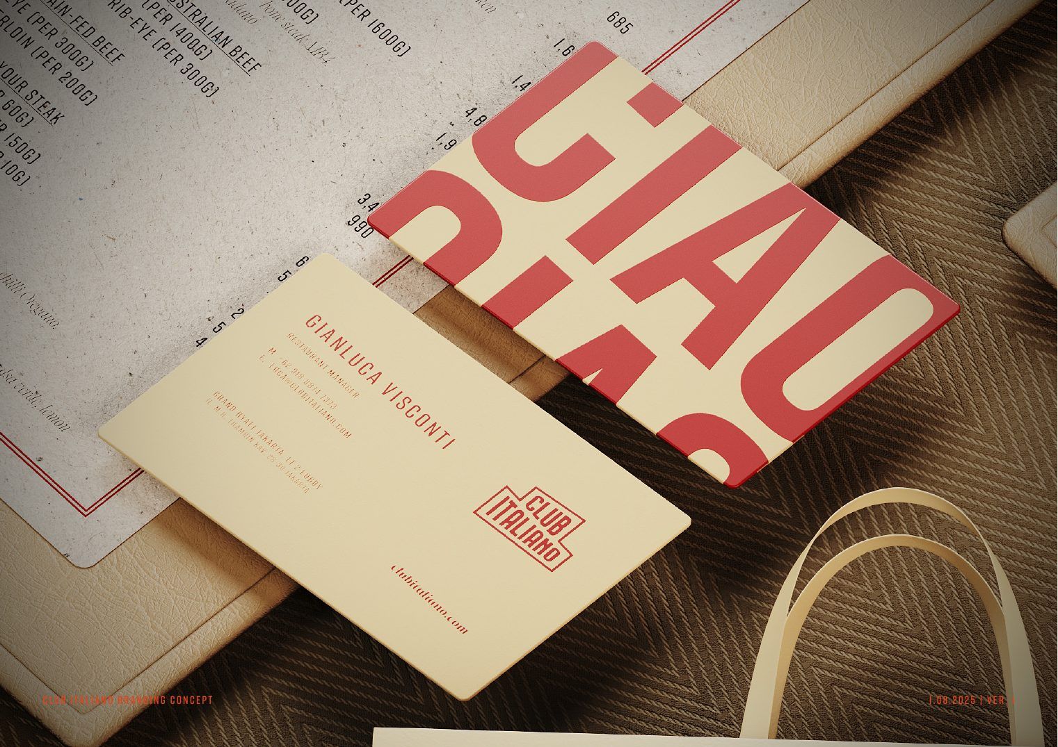
A bolder second chapter: the same club sign, a hotter palette of zucca, pomodoro, ricotta and pesto, and condensed type that shouts across a room.

Refresh concept
Refresh concept
New palette
New palette
Primary type
Primary type
Applications
Applications
Menus and coasters
Menus and coasters
Matchbooks
Matchbooks
Aperitivo menu
Aperitivo menu
Stationery
Stationery

How we do it

The thinking behind the work above.

01Story firstWe start with what the venue is about, then design the look around it.
02Built to be usedEvery rule is written so a chef posting a Story can follow it.
03Ready for the cameraPhotography direction is decided before the first shoot day.

More samples

Other parts of brand & launches.

Want this for your venue?

Start a project →